 |
| https://i.kinja-img.com/gawker-media/image/upload/s--D6kzPEX---/c_scale,f_auto,fl_progressive,q_80,w_800/sxycc7i8ltagaxq0kgka.png |
 |
| https://blogger.googleusercontent.com/img/b/R29vZ2xl/AVvXsEiM-RFDuTYUU9SKi4o2leAcRZF9F0lGHNZ5IXwOsIaBcHxrYgstBSBGM_CK1P_xRWJke2EJiKCg-WSblMb6idTd8ZXruU9KWgRx227QzgvqZlARrOyTwv1bVWP5Qeqd7gbnz6jFm3lRbg/s1600/secondary+colors.jpg |
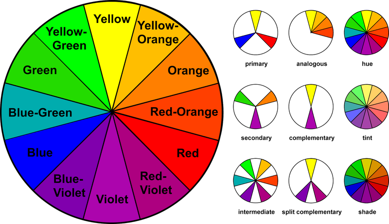
Primary Colors – the sources of all colors, even though there are thousands and thousands of colors in the world, they are all made up of these colors – red, blue and yellow.
 |
| http://www.artaffective.com/files/9914/4235/1796/Secondary_Colors.jpg |
Secondary Colors – are produced when mixing two equal amount of primary colors. If you mix equal amount or yellow and blue you will have green, equal parts of red and blue will have violet, and red and yellow you will have orange. Look at the color wheel you will find these colors – orange, green and violet.
 |
| https://image.slidesharecdn.com/presentation4-140104150120-phpapp01/95/intermediate-color-3-638.jpg?cb=1388847738 |
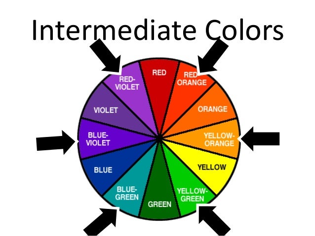
Intermediate Colors – are produced by mixing two equal amount of primary and secondary colors. Example, if you mix equal parts of yellow (primary color) and green (secondary color) you will have yellow-green. Noticed that yellow-green is found between yellow and green on the color wheel.
The intermediate colors are;
|
| https://image.slidesharecdn.com/presentation4-140104150120-phpapp01/95/intermediate-color-3-638.jpg?cb=1388847738 |
Yellow + green = yellow-green Red + violet = red-violet Blue + green = blue-green Red + orange = red-orange Blue + violet = blue-violet Blue + orange = blue-orange
Pure Colors – are the primary, secondary and intermediate colors because they have no white, black and gray in them. Pure colors are also called “normal, true and basic colors”.
 |
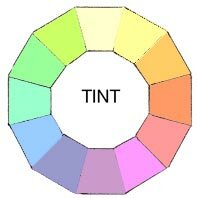
| http://color-wheel-artist.com/wp-content/uploads/2015/07/198xNxcolor-wheel-tint.jpg |
Tints – when pure colors are mixed with white, they are made lighter. Example, when white is added to red you have pink. In other words pink is a tint of red. The more white you add, the lighter the pink will be. Tints are also called “pastels”.
 |
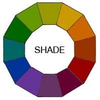
| http://color-wheel-artist.com/wp-content/uploads/2015/07/198xNxcolor-wheel-shade.jpg |
Shades – when pure colors are mixed with black, they are made darker. Example, when black is added to red you have maroon, a shade of red. The more black you add, the more darker you have.
 |
| https://blogger.googleusercontent.com/img/b/R29vZ2xl/AVvXsEitQUi5QVEwIcsKaBfKrsizuz2nEmMbGooNbhbPkV0ZIPLGRm-HPR0_fyX8s810HPpOTzckLU7JZQRWgkaoFTYA_8QqXzhmV5GR2J5OHoacA1SXheHcuWI8GD3d860otTWltmJsoxsExoja/s1600/color+wheels.jpg |
Grayed colors – most colors we used in clothes are grayed colors rather than bright, pure colors you see on the color wheel. Grayed colors are also referred to as “soft colors” or “dull colors”. The more gray you add, the more duller the color will be.
 |
| https://makeupgourmet.com/wp-content/uploads/2016/07/neutral-color-wheel.jpg |
Neutrals – are white, black and gray. They look well with another and with all other colors. The more grayed colors becomes, the more different colors it will harmonize with.
 |
| https://tommybeautypro.files.wordpress.com/2013/01/warm-cool-color-wheel.jpg?w=490&h=457 |
Warm and Cool Colors – are green, blue-green, blue, blue-violet, violet. Blue is the coolest color. They are adjacent to one another in the color wheel. Warm colors – are red, red-orange, orange, yellow-orange, and orange. Red is the warmest color. They are also adjacent in the color wheel.
Qualities of Colors
 |
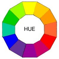
| http://color-wheel-artist.com/wp-content/uploads/2015/07/198xNxcolor-wheel-hue.jpg |
Hue – is the family group name of a color. It is the name of a color. Ones they are combined differently and given new names.
 |
| http://i2.wp.com/30daysweater.com/wp-content/uploads/2014/06/30_Day_Sweater_Hue_Value_Saturation.png |
Value – refers to the lightness or the tint or the darkness of the shade. The scale of the value colors are from the very lightest tint to the very darkest of the shade.
 |
| https://s-media-cache-ak0.pinimg.com/originals/28/7e/05/287e0505f293ec135f65addcc2d38048.jpg |
Intensity – means the brightness or dullness of a color. When you refer to a color as “bright” or “very bright” or “dull” or “very dull” you are describing its intensity. Example, green peppers are bright yellow-green, while olives are dull yellow green.
Color Schemes
The beauty of any color scheme depends upon how well the colors harmonize. To harmonize, colors must appear to belong together.
 |
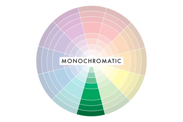
| http://digitalsafari.pbworks.com/f/1410146790/04%20Monochromatic.jpg |
1. One-color harmony (monochromatic color) – the easiest color scheme to follow is one that uses the same color in different values and intensity. Example, dark blue suit with very dark blue accessories and a light blue blouse.
 |
http://www.stitchmyfit.com/blog/wp-content/uploads/2016/06/analog.jpg
|
2. Adjacent color harmony – or analogous color harmony. Since they are near each other on the color wheel, neighbor color harmony. Example, yellow-orange, orange, and yellow green are next to each other on the color wheel; therefore, a pleasing adjacent color harmony may be made from them.
 |
| https://s-media-cache-ak0.pinimg.com/564x/f0/8b/ce/f08bce1ee3eeb23609141c46e79247d9.jpg |
3. Complementary Color Harmony – these are colors that are opposite in the color wheel. Using these colors may be very pleasing.
 |
| https://blogger.googleusercontent.com/img/b/R29vZ2xl/AVvXsEjNIAP01NUvFMimllZhqrVPjoIhchhdis23xB8mr1l2N1ApOGHG4753MEomj57gMLkcauZAlGJh7zaXY6xGxjnNCz5M0-ibdviiLGMORvP4yNlu5k0ulfmJ28G6BF9SS60AbYT8ecLk8Mw/s1600/complementary.png |
a. Complementary colors – directly opposite in the color wheel. Example, red and green, blue and orange, yellow and violet.
 |
| https://ct112013.files.wordpress.com/2013/08/split-complementary-aquilano-rimondi.jpg |
b. Split complementary colors – a variation of the complementary color scheme. In addition to the base color, it uses the two colors adjacent to its complement.
 |
| http://i.imgur.com/e8gRu03.png |
c. Triad - A triadic color scheme uses colors that are evenly spaced around the color wheel. Triadic color harmonies tend to be quite vibrant, even if you use pale or unsaturated versions of your hues.


This comment has been removed by the author.
ReplyDelete